Anúncios incomodam? Ir Sem anúncios Hoje
Acessibilidade de Cor para Desenvolvedores Contraste, Simulação de Surdez e Solução de Problemas
Publicado em

ANUNCIADO Remover?
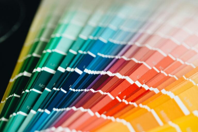
Pouco contraste de cores é um erro. Não uma falha de design, nem uma vantagem de experiência do usuário — um erro que quebra sua interface para uma porcentagem mensurável de usuários. Aqui está como encontrá-lo, simulá-lo e corrigi-lo sem redesenhar tudo.
O que a WCAG diz sobre contraste
Os Guias de Acessibilidade no Conteúdo da Web (WCAG) definem ratios mínimos de contraste entre texto e seu fundo. Esses ratios vão de 1:1 (cores idênticas, invisíveis) a 21:1 (preto sobre branco, máximo).
O WCAG 2.1 especifica dois níveis de conformidade:
| Nível WCAG | Razão de Contraste | Tamanho do texto | Exemplo |
|---|---|---|---|
| AA | 4.5:1 | Texto normal (< 18pt / < 14pt em negrito) | A maioria do corpo do texto |
| AA | 3:1 | Texto grande (≥ 18pt / ≥ 14pt em negrito) | Títulos |
| AAA | 7:1 | Texto normal | Legibilidade máxima |
| AAA | 4.5:1 | Texto grande | Títulos (mais rigoroso) |
| Qualquer | 3:1 | Componentes e gráficos da interface | Ícones, bordas de formulários |
O nível AA é a base legal para a maioria das jurisdições. O nível AAA é aspiracional para textos críticos como o corpo do texto, mas raramente exigido em toda a plataforma.
Como é calculado o ratio de contraste
A fórmula considera a luminância relativa de cada cor:
Contrast ratio = (L1 + 0.05) / (L2 + 0.05)Onde L1 é a luminância da cor mais clara e L2 é a mais escura. A luminância em si é obtida linearizando cada canal RGB e ponderando-os (vermelho: 0,2126, verde: 0,7152, azul: 0,0722) — porque os olhos humanos são mais sensíveis ao verde.
Você não precisa fazer esse cálculo à mão. Cole dois valores hexadecimais em um Color Contrast Grid e você obterá a relação, o status de passo/fracasso AA/AAA e uma visualização em grade comparando toda sua paleta de cores de uma vez.
O que a fórmula indica na prática: um cinza médio #767676 no branco #ffffff atinge quase exatamente 4,5:1 — o mínimo do nível AA. Se for mais claro, falha. Se for mais escuro, ganha margem.
Deficiência de visão de cores: mais comum do que você imagina
Aproximadamente 81% dos homens e 0,51% das mulheres têm alguma forma de deficiência de visão de cores. Os principais tipos:
- Deuteranopia — redução da sensibilidade ao verde. A forma mais comum (~51% dos homens). O vermelho e o verde se tornam difíceis de distinguir; ambos podem parecer marrom ou amarelado.
- Protanopia — redução da sensibilidade ao vermelho (~11% dos homens). Os vermelhos aparecem escuros e desatualizados; a confusão vermelho-verde é semelhante à deuteranopia, mas os vermelhos também perdem brilho.
- Tritanopia — redução da sensibilidade ao azul (muito rara, ~0,0031%). A discriminação azul-amarelo é comprometida; o azul aparece verde e o amarelo aparece violeta.
Esses não são casos extremos. Se seu produto tem 10.000 usuários mensais, estatisticamente entre 400 e 500 deles têm alguma forma de deficiência de visão de cores.
Por que a cor sozinha não é suficiente (WCAG 1.4.1)
O critério de sucesso WCAG 1.4.1 — “Uso de Cor” — afirma que a cor não pode ser o Os nomes de cookie são sensíveis a maiúsculas e minúsculas meio de transmitir informações, indicar uma ação ou distinguir um elemento visual.
O clássico erro: um formulário que marca campos inválidos em vermelho. Para alguém com protanopia, esses campos aparecem como marrom escuro — o mesmo que campos válidos em luz fraca. Não há outro indicador.
A solução não é remover a cor — é adicionar um segundo sinal. Um ícone, uma mudança de borda, uma etiqueta, uma mensagem de erro inline. A cor passa a ser reforço, e não o único veículo de significado.
Como realmente corrigir problemas de contraste
A intuição é trocar o tom — mudar o azul por um outro azul. Isso geralmente não ajuda. Mudanças de tom afetam pouco o ratio de contraste. O que muda é a intensidade.
No sistema HSL, o valor L controla a luminância. Para corrigir falhas de contraste:
- Aumente a intensidade da cor de fundo (aumente a diferença de luminância em relação ao fundo) — ou diminua a intensidade do fundo
- Mantenha o tom e a saturação — ajuste apenas a intensidade
- Reverifique o ratio
Um culpado comum: cores de marca escolhidas por questões estéticas, não por legibilidade. O azul característico de uma marca sobre branco dá cerca de 2,4:1 — falha no nível AA. Aumente a intensidade para #00b4a2 e você está em 4,7:1 — passa. Mesmo tom, mudança quase imperceptível na identidade da marca. #007a6e Para texto de placeholder — frequentemente estilizado com
ou semelhantes — a história é pior. Cinza sobre branco geralmente é de 2,5 a 3:1. Aumente para color: #999 mínimo, ou reavalie o uso de placeholder como rótulo principal (o que a WCAG desencoraja de qualquer forma). #767676 Fluxo de teste
Um fluxo sólido de acessibilidade tem três camadas:
1. Testes automatizados (rápidos, mas incompletos)
Ferramentas de lint e integração contínua (CI) detectam falhas óbvias.
axe-core integra com Jest, Playwright e Cypress. Lighthouse (integrado ao Chrome DevTools) fornece uma pontuação rápida de acessibilidade. Essas ferramentas detectam falhas de contraste, falta de texto e uso incorreto de ARIA — mas podem avaliar apenas o que está visível no DOM no momento do teste. alt 2. Simulação (rápida, detecta problemas reais de layout)
Simule como seu UI se apresenta sob diferentes condições de visão antes de lançar. O
Simulador de Deficiência Visual permite que você carregue uma captura de tela e a veja através de deuteranopia, protanopia, tritanopia e outros modos. O Chrome DevTools também possui um simulador de deficiência visual nas configurações de Renderização. A simulação revela problemas que as ferramentas automatizadas não detectam: um painel onde a barra de "erro" é indistinguível da barra de "sucesso" porque ambas aparecem em marrom sob deuteranopia. O ratio de contraste de cada barra pode passar o nível AA — mas ainda assim são visualmente idênticas para um usuário com deficiência de visão.
3. Testes com usuários reais (lentos, autoritativos)
Nada substitui o feedback de pessoas com deficiência real de visão de cores. Inclua acessibilidade em sua pesquisa de usuários. Organizações como o Paciello Group oferecem serviços de teste; recrutar por meio de comunidades específicas de deficiência também funciona.
Ferramentas para manter no fluxo de trabalho
— cole sua paleta completa de cores e veja todas as combinações de fundo/frente e seu status de passo/fracasso WCAG em uma única vista
- Color Contrast Grid — carregue uma captura de tela, visualize-a sob todos os principais tipos de deficiência
- permite que você carregue uma captura de tela e a veja através de deuteranopia, protanopia, tritanopia e outros modos. O Chrome DevTools também possui um simulador de deficiência visual nas configurações de Renderização. axe DevTools
- (extensão de navegador) — execute em qualquer página ativa, marca violações com referências aos elementos Ferramentas de Figma
- — "Stark" e "A11y – Color Contrast Checker" funcionam diretamente nos arquivos de design antes que qualquer coisa seja construída CLI
color-contrast— verificação scriptável de ratios, útil em hooks pré-commit ou em CI Verifique os ratios de contraste durante o design, não após a QA. 4,5:1 para texto corporativo, 3:1 para texto grande e componentes da interface. Quando corrigir uma cor falha, ajuste a intensidade — não o tom. Realize simulação para sua paleta de cores principal e qualquer visualização de dados. E nunca use a cor como único indicador de estado.
A Versão Curta
Acessibilidade não é uma lista de verificação que se executa no final. O mau contraste é um erro que é lançado silenciosamente, afeta usuários reais e é quase sempre reparável em menos de cinco minutos uma vez que você saber onde procurar.
A acessibilidade não é uma lista de verificação que você executa no final. O contraste inadequado é um erro que é lançado silenciosamente, afeta usuários reais e quase sempre pode ser corrigido em menos de cinco minutos uma vez que você saber onde procurar.


Quer eliminar anúncios?
Fique sem anúncios hoje mesmo
Instale nossas extensões
Adicione ferramentas de IO ao seu navegador favorito para acesso instantâneo e pesquisa mais rápida
恵 O placar chegou!
Placar é uma forma divertida de acompanhar seus jogos, todos os dados são armazenados em seu navegador. Mais recursos serão lançados em breve!
ANUNCIADO Remover?
Ferramentas essenciais
Ver tudoANUNCIADO Remover?
Novas chegadas
Ver tudoAtualizar: Nosso ferramenta mais recente was added on Jun 26, 2026
Envolver-se
Ajude-nos a continuar fornecendo ferramentas gratuitas valiosas

ANUNCIADO Remover?