
不喜欢广告? 去 无广告 今天
色彩对比不足是一个错误,而不是设计疏忽或用户体验上的小技巧——这是一个会破坏界面并影响可测量比例用户的问题。以下是查找、模拟和修复该问题的方法,而无需重新设计整个界面。
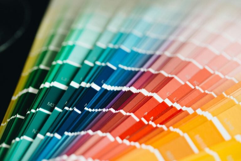
W3C关于对比度的规定
网页内容可访问性指南(WCAG)定义了文本与其背景之间的最低对比度比率。这些比率从1:1(相同颜色,不可见)到21:1(黑色背景上的白色,最大值)不等。
WCAG 2.1规定了两个符合等级:
| WCAG等级 | 对比度 | 文本大小 | 例子 |
|---|---|---|---|
| AA | 4.5:1 | 正常文本(<18pt / <14pt粗体) | 大部分正文内容 |
| AA | 3:1 | 大文本(≥18pt / ≥14pt粗体) | 标题 |
| AAA | 7:1 | 正常文本 | 最高可读性 |
| AAA | 4.5:1 | 大文本 | 标题(更严格) |
| 任何 | 3:1 | 用户界面组件和图形 | 图标、表单边框 |
AA是大多数司法管辖区的法律基准。AAA适用于关键文本如正文,但很少在整个网站上强制要求。
对比度比率的计算方法
该公式使用每种颜色的相对亮度值:
Contrast ratio = (L1 + 0.05) / (L2 + 0.05)其中 L1 是较亮颜色的亮度值, L2 是较暗颜色的亮度值。亮度本身来自对每个RGB通道进行线性化并加权(红色:0.2126,绿色:0.7152,蓝色:0.0722)——因为人眼对绿色最敏感。
你不需要手动进行这些数学运算。将两个十六进制值粘贴到 颜色对比网格 中,你将获得比率、AA/AAA通过或失败状态,以及一次查看整个配色方案的网格视图。
该公式在实际中的含义是:中灰色 #767676 在白色背景上 #ffffff 达到几乎精确的4.5:1——即AA最低标准。变亮则失败,变暗则增加安全余量。
色盲:比你想象的更常见
大约81%的男性和0.51%的女性存在某种形式的色觉缺陷。主要类型包括:
- 去色盲(Deuteranopia) ——绿色敏感度下降。这是最常见的类型(约51%的男性)。红色和绿色难以区分,两者可能都呈现为棕色或黄色。
- 红敏缺陷(Protanopia) ——红色敏感度下降(约11%的男性)。红色看起来较暗且饱和度低;红绿混淆与去色盲类似,但红色还会失去亮度。
- 三色盲(Tritanopia) ——蓝色敏感度下降(极为罕见,约0.0031%)。蓝黄辨别能力受损;蓝色看起来像绿色,黄色看起来像紫色。
这些情况并非罕见。如果你的产品每月有10,000名用户,统计上大约有400到500人存在某种形式的色觉缺陷。
为什么仅靠颜色是不够的(WCAG 1.4.1)
WCAG成功标准1.4.1——“颜色的使用”——指出颜色不能作为传达信息、指示操作或区分视觉元素的手段。 分割 经典失败案例:表单用红色标记无效字段。对于有红敏缺陷的用户,这些字段看起来是暗棕色,与在暗光下正常字段无异。没有其他提示。
解决方案不是去掉颜色,而是增加第二信号。例如图标、边框变化、标签或错误消息。颜色成为辅助,而非唯一传达意义的手段。
如何真正解决对比度问题
本能做法是改变色调——将蓝色换成另一种蓝色。这通常没有帮助。
色调变化对对比度比率影响很小。亮度变化才是关键。 在HSL中,L值控制亮度。要解决对比度失败问题:
加深前景颜色(增加与背景的亮度差异)——或变亮背景
- 保持色调和饱和度——只调整亮度
- 重新检查对比度比率
- 常见问题:为美观而选择的品牌色,而非可读性。一个品牌的标志性青色
在白色背景上对比度约为2.4:1——未达到AA标准。加深到 #00b4a2 后,对比度达到4.7:1——通过标准。色调保持一致,品牌识别变化几乎不可察觉。 #007a6e 对于占位文本——通常使用
或类似颜色——情况更糟。灰色在白色背景上的对比度通常为2.5–3:1。提升到 color: #999 最低标准,或重新考虑是否将占位文本作为主要标签(这与WCAG建议避免的做法一致)。 #767676 测试工作流程
一个可靠的可访问性工作流程包含三个层次:
1. 自动检查(快速,但不全面)
检查器和CI工具能发现明显失败。
axe-core 可与Jest、Playwright和Cypress集成。Lighthouse(内置Chrome DevTools)可提供快速的可访问性评分。这些工具能检测对比度失败、缺失 文本和ARIA误用——但它们只能评估测试时DOM中可见的内容。 alt 2. 模拟(快速,能发现真实布局问题)
在发布前模拟不同视觉条件下的UI外观。使用
色盲模拟器 可上传截图并查看其在去色盲、红敏、三色盲等模式下的效果。Chrome DevTools的渲染设置中也提供视觉缺陷模拟器。 模拟揭示了自动化工具无法发现的问题:一个仪表盘中,“错误”条形图与“成功”条形图在去色盲下看起来都是棕色,无法区分。每个条形图的对比度比率可能通过AA标准——但对色盲用户而言,它们在视觉上是相同的。
3. 真实用户测试(缓慢,权威)
没有比来自真正有色觉缺陷用户的反馈更权威的测试。将可访问性纳入你的用户研究中。像Paciello Group这样的组织提供测试服务,也可以通过特定残疾社群进行用户招募。
工作流程中应保留的工具
——粘贴完整配色方案,一次性查看所有前景/背景组合及其WCAG通过或失败状态
- 颜色对比网格 ——上传截图,预览其在各种主要缺陷类型下的效果
- 可上传截图并查看其在去色盲、红敏、三色盲等模式下的效果。Chrome DevTools的渲染设置中也提供视觉缺陷模拟器。 axe DevTools
- (浏览器扩展)——在任何实时页面上运行,能标记出违规元素并提供具体引用 Figma插件
- ——“Stark”和“A11y – Color Contrast Checker”可在设计文件中直接使用,无需构建前就进行检查 命令行工具
color-contrast——可脚本化对比度检查,适用于预提交钩或CI流程 在设计阶段检查对比度,而不是在质量保证阶段之后。正文文本需达到4.5:1,大文本和UI组件需达到3:1。当你修复一个对比失败的颜色时,应调整亮度而非色调。对主要配色方案和任何数据可视化进行模拟测试。永远不要仅用颜色来指示状态。
简明版
可访问性不是在最后才检查的清单。对比度不足是一个会静默发布、影响真实用户的问题,而且几乎总是可以在五分钟内修复,只要你知道该从哪里入手。
可访问性不是一项可以在最后检查的清单。对比度不足是一个错误,它会静默发布,影响真实用户,并且在你知道该查看哪里后,几乎总能在五分钟内修复。

