
Don't like ads? Go Ad-Free Today
CSS gradients are one of those features that look simple until you’re staring at a muddy brown blob where you expected a clean fade from blue to purple. The syntax has quirks, the debugging path is opaque, and most tutorials stop right before the problems start.
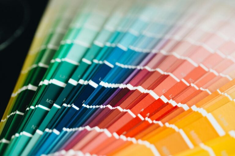
This is a practical reference. Every concept has working code. Open a CSS gradient generator in another tab — you’ll want to experiment as you read.
The Three Types — and When to Reach for Each
linear-gradient is for anything directional: hero backgrounds, button fills, dividers.
background: linear-gradient(135deg, #6366f1, #8b5cf6);radial-gradient radiates from a center point — good for spotlight effects, glows, and circular UI elements.
background: radial-gradient(circle at 30% 40%, #f59e0b, #ef4444);conic-gradient sweeps around a center angle — the right choice for pie charts, loading spinners, and color wheels.
background: conic-gradient(from 90deg, #3b82f6, #8b5cf6, #3b82f6);Rule of thumb: if the transition flows in a direction, use linear. If it radiates, use radial. If it rotates, use conic.
Syntax Breakdown: The Parts That Trip People Up
The most common source of confusion is direction vs. angle. to right and 90deg both produce a left-to-right gradient, but they differ in how they handle non-square elements. Use keyword directions (to right, to bottom right) when you want the gradient to adapt to the element’s shape. Use degree values when you need exact control.
Color stops are where precision matters:
/* Even distribution — browser figures out spacing */
background: linear-gradient(to right, #f97316, #8b5cf6);

/* Explicit stops */
background: linear-gradient(to right, #f97316 0%, #f97316 30%, #8b5cf6 60%, #8b5cf6 100%);
The second version holds solid orange for 30%, then transitions to purple. Without explicit positions, you get a smooth, even blend.
You can also force a hard color edge — useful for striped patterns:
/* Hard mid-stop: sharp color transition at 50% */
background: linear-gradient(to right, #3b82f6 50%, #ef4444 50%);
Common Problems and What’s Actually Causing Them
Banding — visible stripes instead of a smooth gradient — usually appears with low-contrast or dark-to-dark transitions. Adding a subtle mid-stop and nudging the colors apart slightly often fixes it:
/* Before — banding prone */
background: linear-gradient(180deg, #1e1b4b, #312e81);

/* After — add a mid nudge */
background: linear-gradient(180deg, #1e1b4b 0%, #2e2b6e 50%, #312e81 100%);
Colors not blending cleanly — purple turning brownish between red and blue — is a known sRGB issue. CSS Color Level 4 introduced in oklab interpolation, which blends through perceptual color space instead:
/* Modern — cleaner blends */
background: linear-gradient(in oklab to right, #ef4444, #3b82f6);
Browser support is solid in 2026. If you need legacy coverage, keep the standard gradient as a fallback above it.
Conic gradients in older WebKit: add a solid-color fallback for functional uses — pie charts, progress indicators — since decorative failures are fine, but broken UI is not:
.pie {
  background: #6366f1; /* fallback */
  background: conic-gradient(#6366f1 var(--pct), #e5e7eb var(--pct));
}
Layering Gradients
CSS backgrounds accept multiple values — gradients stack like layers, top to bottom in the declaration order:
background:
  linear-gradient(rgba(0, 0, 0, 0.4), rgba(0, 0, 0, 0.4)),
  radial-gradient(ellipse at 20% 80%, #6366f1 0%, transparent 60%),
  radial-gradient(ellipse at 80% 20%, #f59e0b 0%, transparent 60%),
  #0f172a;
The dark overlay sits on top, two glows sit underneath it, and a solid fallback is at the bottom. This pattern is common for hero sections that need depth without loading an image.
One constraint: gradient layers with rgba or transparent stops interact with what’s below them in the same background stack, not with the page background. Plan your layer order accordingly.
CSS Variables Make Gradients Themeable
Hard-coded color values in gradients break theme systems. Define stops as variables instead:
:root {
  --gradient-start: #6366f1;
  --gradient-end: #8b5cf6;
  --gradient-angle: 135deg;
}

.card {
  background: linear-gradient(var(--gradient-angle), var(--gradient-start), var(--gradient-end));
}

[data-theme="warm"] {
  --gradient-start: #f97316;
  --gradient-end: #ef4444;
}
Switching themes becomes a single variable override. Combine this with @property to enable animated gradients — without it, CSS can’t interpolate between gradient values:
@property --gradient-angle {
  syntax: '<angle>';
  initial-value: 135deg;
  inherits: false;
}

@keyframes rotate-gradient {
  to { --gradient-angle: 495deg; }
}

.animated {
  animation: rotate-gradient 4s linear infinite;
  background: linear-gradient(var(--gradient-angle), #6366f1, #8b5cf6);
}
Performance: When a Gradient Costs More Than an Image
Gradients are rasterized at paint time on the GPU. For static, simple gradients, this is lighter than an HTTP request for an image. But complex layered gradients on frequently-repainted elements can create paint bottlenecks.
Watch for these patterns:
- More than 3–4 gradient layers on a single element
- Gradients on
position: fixedbackgrounds — they repaint on every scroll frame - Animated gradients without
@property— these force full repaints instead of composited updates
Profile in DevTools → Performance before optimizing. Most gradient use is nowhere near these limits. When you do hit a bottleneck, converting to a prerendered image or switching to @property-based animation is the right fix.
Start with the Generator, Finish in Code
The fastest path to a working gradient is visual: use the CSS Gradient Generator to dial in your colors and positions, then copy the output into your stylesheet. From there, the techniques above — variable extraction, layering, oklab interpolation — let you extend it into something production-ready without guessing.


Want To enjoy an ad-free experience?
Go Ad-Free Today
Install Our Extensions
Add IO tools to your favorite browser for instant access and faster searching
恵 Scoreboard Has Arrived!
Scoreboard is a fun way to keep track of your games, all data is stored in your browser. More features are coming soon!
ADVERTISEMENT · REMOVE?
Must-Try Tools
View AllADVERTISEMENT · REMOVE?
New Arrivals
View AllUpdate: Our latest tool was added on Jun 15, 2026
Get Involved
Help us continue providing valuable free tools

ADVERTISEMENT · REMOVE?