

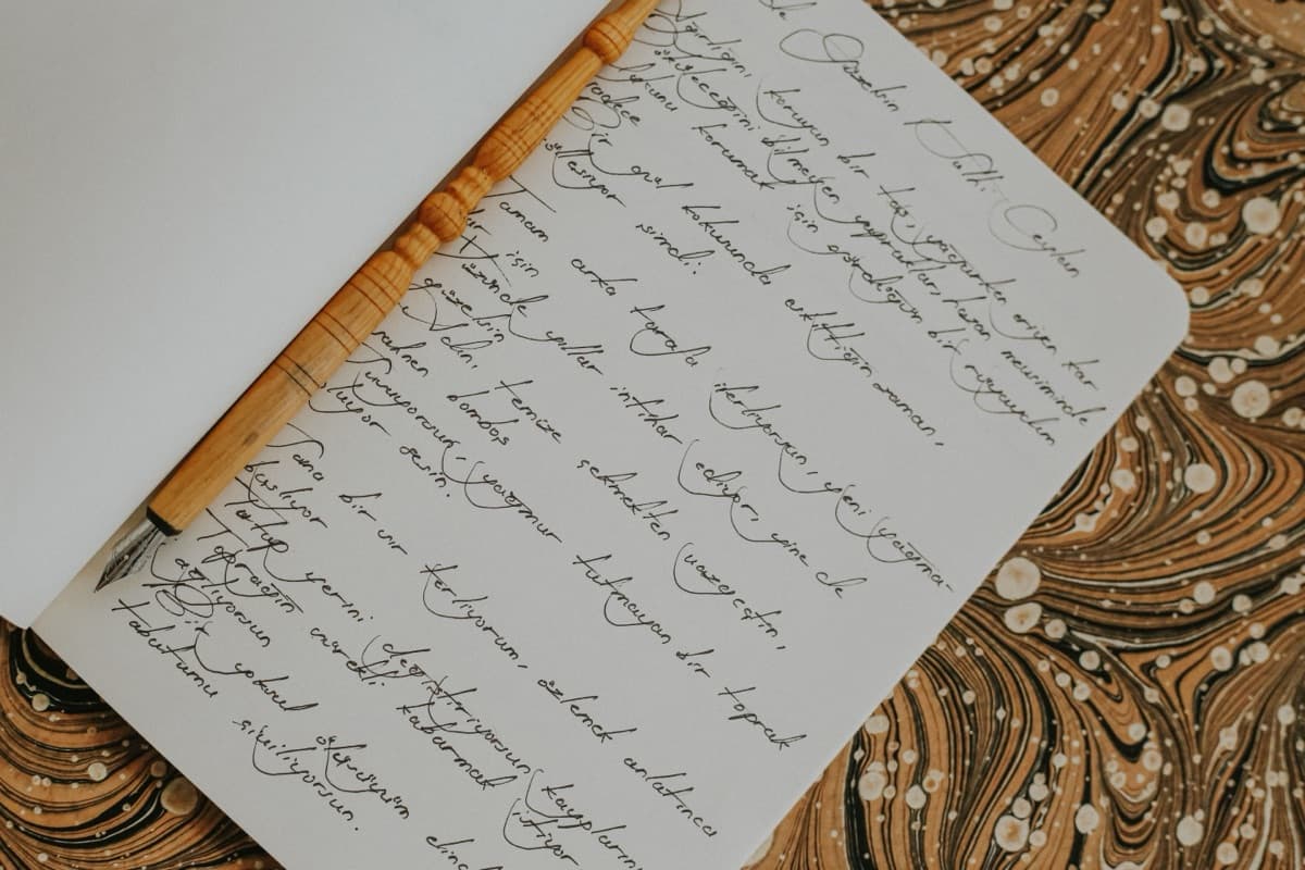
Every text-to-handwriting converter you will find, including the one on this site, is a font with a wobble filter. Not a pen simulation. Not a model that learned your hand. A typeface that happens to look handwritten, plus per-character jitter to break up the machine-perfect rhythm that would otherwise scream "typeset." Once you accept that framing, these tools become genuinely good at four or five jobs and obviously wrong for everything else — and almost everyone who comes away disappointed arrived expecting the other thing.
Does converted text actually look handwritten? At a glance, on a card, in a thumbnail — yes, comfortably. Under any real scrutiny — no, and the reason never changes: a font has exactly one outline per character, so every "a" on the page is the identical shape. Software can rotate and nudge those identical shapes to break up the spacing, and that is enough to pass at arm's length. It is not enough to pass someone holding the paper, because no human being writes the same letter twice.
Three ways to fake a hand
Handwriting webfont rasterised in a canvas. The overwhelmingly common approach, and the one behind most of the results on the first page of search. Set the text in a DOM node using a Google Fonts handwriting face — Caveat, Kalam, Patrick Hand — lay that node over a scanned-paper JPEG, then screenshot it with html-to-image or html2canvas and hand back a PNG. Cheap to build, and the scanned paper does most of the believability work. This site's own converter shipped this way on the old WordPress stack.
True stroke simulation. Rare, and the only family that actually solves the repeated-letter problem. Instead of rendering glyph outlines, you model the pen tip as a sequence of x/y coordinates plus a pen-up flag and generate that sequence. Alex Graves's 2013 paper Generating Sequences With Recurrent Neural Networks trained an LSTM on the IAM online handwriting corpus and could synthesise new handwriting conditioned on a text string, sampling a different rendering of the same letter each time it appeared. calligrapher.ai is the demo everyone links, and it still looks better than font-based output on a word like "assessment." Practically nothing consumer-facing uses this, because you trade away direct control — you cannot just swap in a nicer typeface when the client hates the letterforms.
Glyph outlines plus per-character transforms in vector output. What the converter here does, and worth explaining because it is the least common of the three. SVG <text> accepts per-glyph lists for rotate, dx and dy, so each character can be tilted and nudged individually while the font keeps its own advance widths. No canvas, no raster step:
<text x="56" y="107.2" xml:space="preserve"
      dx="0.18 0.22 -0.78 0.4 -0.35 …"
      dy="0.39 -0.55 0.62 -0.03 0.15 …"
      rotate="0.19 -0.3 0.36 1.18 -0.77 …">Meet me at 4pm.</text>
At the default messiness of 4 with 24px text, that resolves to a maximum tilt of 1.4° and 0.8px of vertical wander per character. The wobble is derived from each character's position rather than a random number, so the same input always produces a byte-identical file. You get a vector page — A4 at 794px wide, sharp at any print size, editable in Figma or Illustrator.
The cost of that self-contained vector file is real, though: it carries no embedded font. An SVG rendered through a data: URI cannot fetch a webfont, and inlining a handwriting family would add megabytes, so each style is a stack of faces commonly installed on desktops — Segoe Print, Bradley Hand, Chilanka, Apple Chancery — ending in generic cursive. Paper, ink, layout and wobble are baked in and identical everywhere. The letterforms are whatever the viewing machine happens to have. Your render and your colleague's Windows render are not the same hand.
That has a second-order effect worth knowing before you paste 4,000 characters in. Line wrapping is an estimate, not a measurement — the conversion runs without a DOM to measure glyphs in, so it assumes roughly half an em per character, which works out to 57 characters per line on ruled paper at 24px. A local face wider than that estimate can push a line past the right margin. Shorter lines and a size bump fix it; there is no reflow to fall back on.
The five things that give it away
- Repeated letters are literally identical. Type "assessment" and the three s-shapes are the same outline rotated by fractions of a degree. Real handwriting varies the shape — a looser loop, a shorter tail — not just the angle. This is the tell that stroke simulation exists to fix, and the one no font-based tool can fix.
- Stroke weight never varies. The ink is one flat fill colour at one width. Real ink darkens and widens where the pen slows through a curve, thins on a fast diagonal, and a ballpoint skips outright on the upstroke.
- The line never drifts. Per-character offsets are emitted as deltas precisely so they do not accumulate — the baseline is pinned. Genuine handwriting climbs above or sinks below the rule over the course of 60 characters and then corrects. A line that ends exactly as level as it started is unnatural in a way people notice before they can name it.
- The paper is too clean. Flat vector fills: an off-white page with pale blue rules and nothing else. No paper grain, no fibre, no gutter shadow, no bleed-through from the page behind. The old scanned-JPEG approach was honestly better here, and losing it is the price of a self-contained vector file rather than a 400KB PNG.
- Cursive joins snap apart. Rotating individual glyphs in a connecting script pulls the joins open. On the Cursive script style, turning messiness up makes the result less believable, not more — the opposite of the intuition everyone brings to that slider.
Where it is genuinely the right tool
Cards, invitations and gift tags, where the output is printed and read at conversational distance. Design mockups — a handwritten annotation layer over a UI comp, or signature-style lettering standing in for the real hand-lettering artist you have not commissioned yet. Teacher worksheets and tracing practice, where the machine consistency you fight everywhere else is the entire point: pick Neat handwriting at messiness 1 or 2 and you get a legible model hand that a real teacher's writing could never match for uniformity. Journal and scrapbook layouts. And because the file is vector, dropping it into Figma and scaling it to poster size costs nothing.
The one place it is not the right tool is schoolwork you are supposed to have written yourself. Most institutions treat generated handwriting handed in as your own as academic dishonesty, and the tool's own documentation refuses that use case. It is a lettering tool, not a forgery tool.
Common mistakes
Picking the most uniform font, then cranking messiness to compensate
Marker and Casual print are the most even faces available, and the reflex when they read as robotic is to push messiness to 10. That adds a uniform ±3.5° jitter to identical shapes, which is not character — it is the same font, shaken. It replaces one tell with a louder one. Choose the face that suits the piece first, then leave messiness somewhere between 3 and 5; the honest range where it reads as a hand rather than as a filter is narrower than the slider suggests.
Fighting the layout instead of using the size control
There is deliberately no line-spacing setting. Line height is locked at 1.8× the font size, and the ruling is drawn at that computed height, so the text always sits on the line — that alignment is the single most convincing thing on the page and it is not worth breaking. Size is your spacing control: 32px gives you wide-ruled paper with large letters, 16px gives tight notebook lines. Padding with blank lines to force spacing just produces empty rules, which looks like exactly what it is.
Related, and more consequential than font choice: do not leave the paper on Blank for anything meant to read as a note. Ruling and the red college margin carry more believability than the typeface does. Blank is for lettering you intend to composite over your own texture later.
Deploying it anywhere it has to actually pass
A signature on a document. A "personally handwritten" note sent to ten thousand customers. Anything where a human will hold the paper, or where being caught costs something. It does not pass, and the downside is wildly disproportionate to the two minutes it saved.
Run through the five tells above with your own output in front of you and you will know within about thirty seconds which side of that line your use case sits on. For everything on the safe side, the converter is a two-minute job: start at Ruled, Casual print, messiness 4, and when it looks off, turn the size up before you turn the mess up.
Cover photo by betül nur akyürek on Pexels.